Overview
Codi's AI assistant lets office managers request and manage services through natural language: ordering pantry items, scheduling cleanings, making changes to existing orders. Launching our Slack integration felt like the right opportunity to finally prioritize widgets in our portal chat. With vibe coding, I could own it with a bit of initial engineering support. Designed in 1 day, shipped in under 7 days.
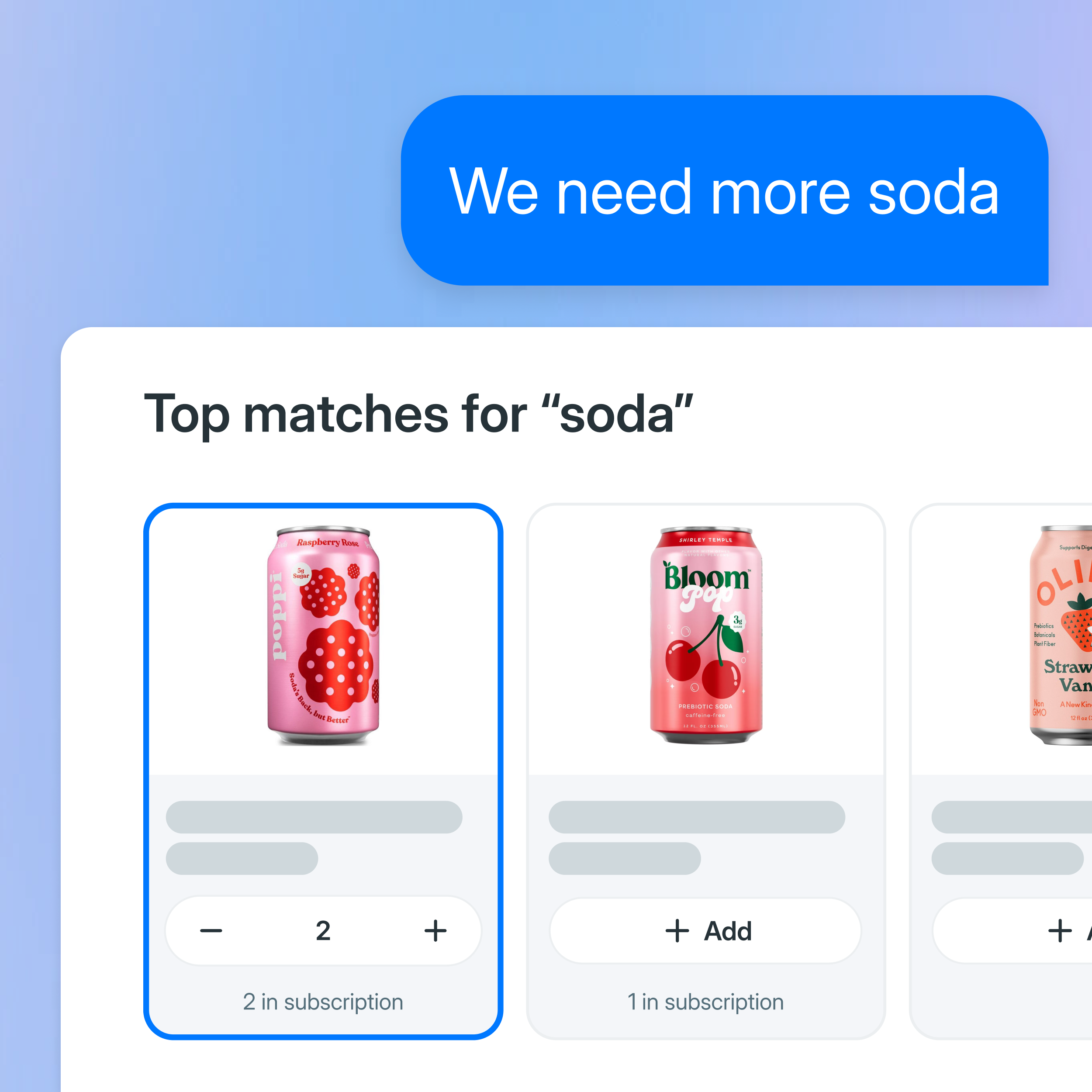
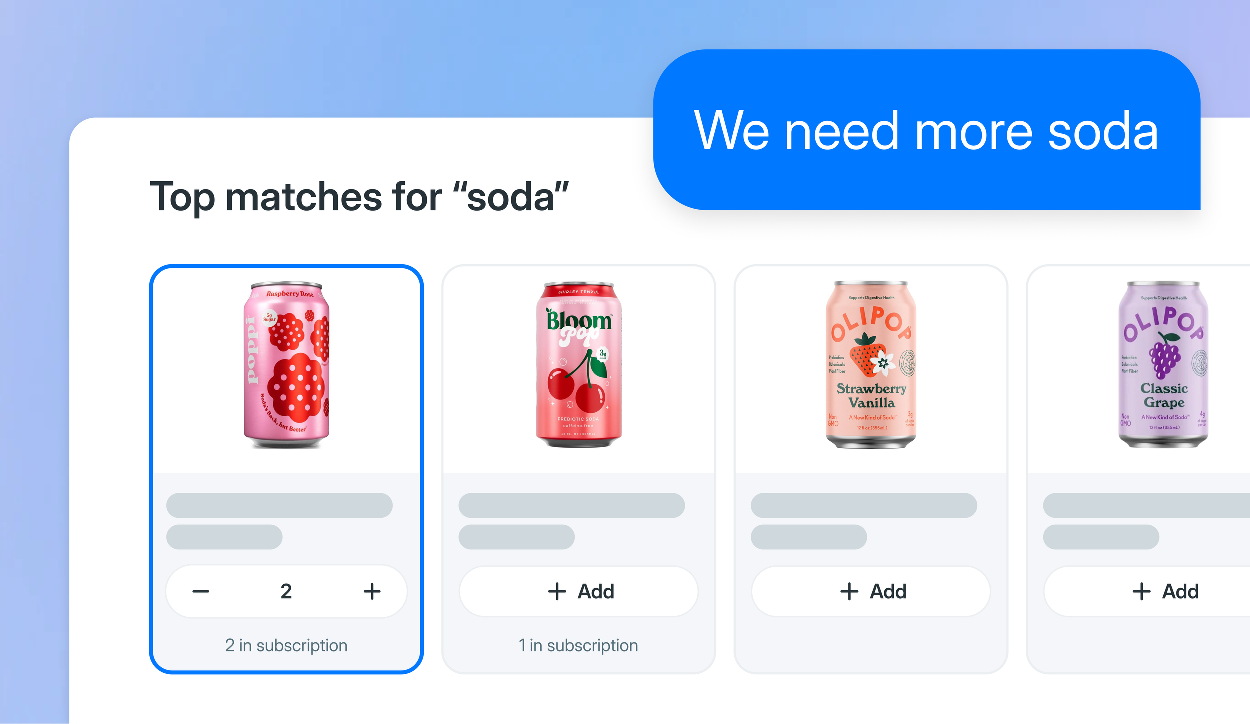
I replaced text confirmations with interactive widgets so clients could act directly in the conversation — no typing, no ambiguity about what changed. Designed as a reusable pattern so future widget types could be added without starting from scratch.
Impact
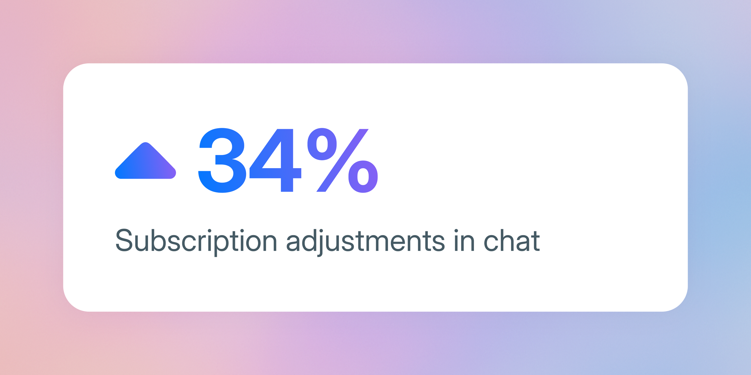
34% more clients completed subscription adjustments vs. the pre-widget baseline inside the AI chat interface
New item browsing stayed in the catalog, where users could see details and make considered decisions
Established a reusable interaction pattern for future service widgets
Contribution
Problem identification
Interaction design
Code (Cursor)
Team
Design (Me)
Engineering (1 Engineer)
Problem
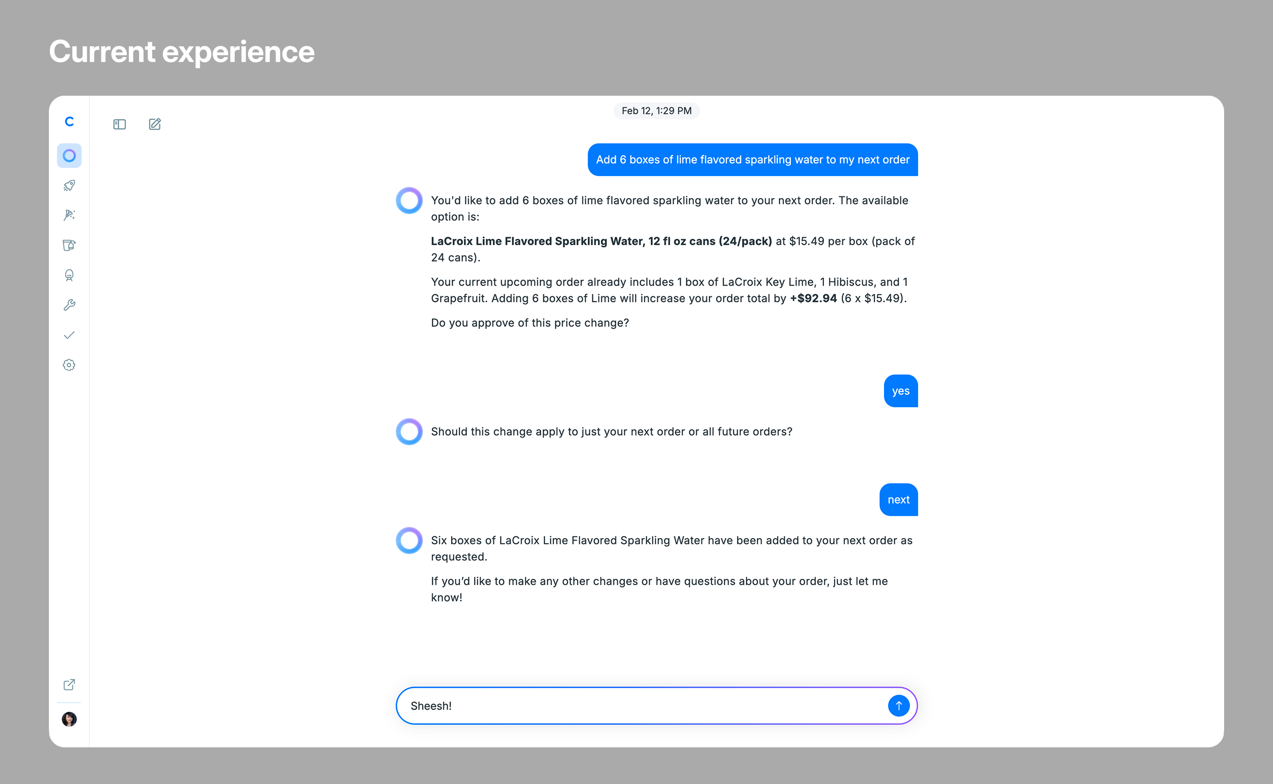
Typing “yes” to approve a price change or “next” to confirm a subscription update put the weight of a real decision on a casual gesture. These weren’t low-stakes actions. They affected budgets and showed up at someone’s office door. After confirming, the text response didn’t reflect that anything meaningful had happened.
Process
Mapping the Decision
The stakes of the action and the mechanics of confirming it were completely mismatched. I aligned with our engineer on a widget approach that would let clients act directly in the conversation and leave a record when they did.
Get it working, then get it right
Our engineer built a functional version to validate that the widget approach was technically feasible.
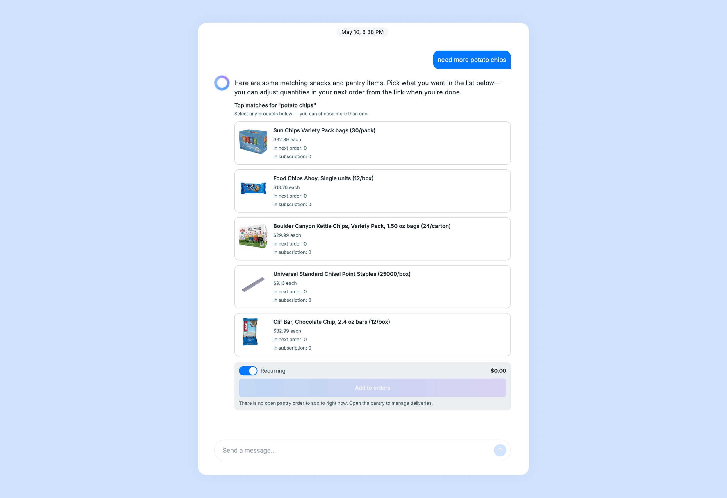
It worked, but surfaced two issues.
The widget dominated vertical space in a chat interface where screen real estate affects how much of the conversation a user can see.
After confirming, the widget collapsed into a disabled state. A toast briefly appeared then vanished, leaving no trace of what had changed
Solution
A confirmation that closes the loop
The new widget moves through three stages so the answer is always visible:
Default: items shown, actions available
Selection: user picks items, cost summary updates in real time
Confirmation: widget and AI message both update to reflect what was ordered, a permanent record in the conversation
For someone approving a purchase that affects a budget and shows up at their door, closing that loop matters.
Compact enough to stay in context
A widget that takes over the screen breaks the conversation. I switched to a carousel: bigger images, half the vertical footprint, using quantity selectors already familiar from the shop. The widget needed to earn its space.
Outcomes
Subscription adjustments in the AI chat increased 34% after launch. Clients managed what they already knew directly in the conversation. New item discovery stayed in the catalog — the alpha doesn't yet support browsing or item details in context, and users went where they could see what they were committing to.
Learnings
Ship fast, fix the pattern early
Skipping Figma and iterating in code was the right call. The back-and-forth happened in the codebase, not a handoff doc, and it shipped faster because of it. Fix a pattern before it proliferates — catching this with one widget type kept the fix clean.
Next layer of polish
The widget doesn't yet surface item details in context. Tapping a product should show more without breaking the conversation flow.
The AI chat needs more granular loading states. Papers, summaries, and synthesis load independently and each can succeed, fail, or still be loading. Streaming text, retryable errors, and handling slow connections are all unsolved.
The pattern going forward
Surface options, confirm details, close with a record. The flows vary by service. The closing moment is the same.