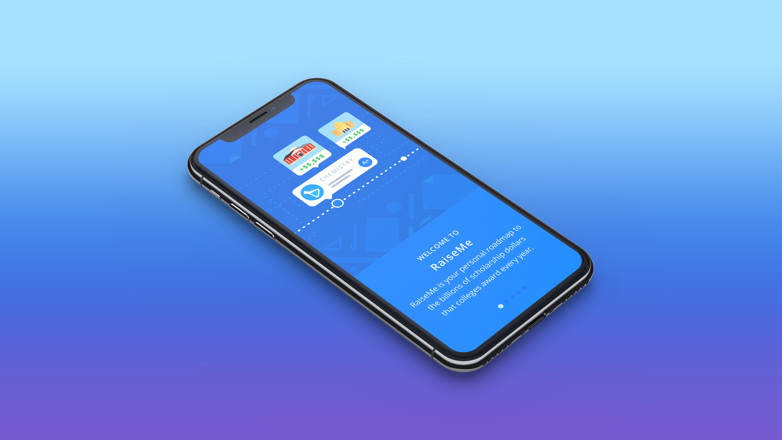
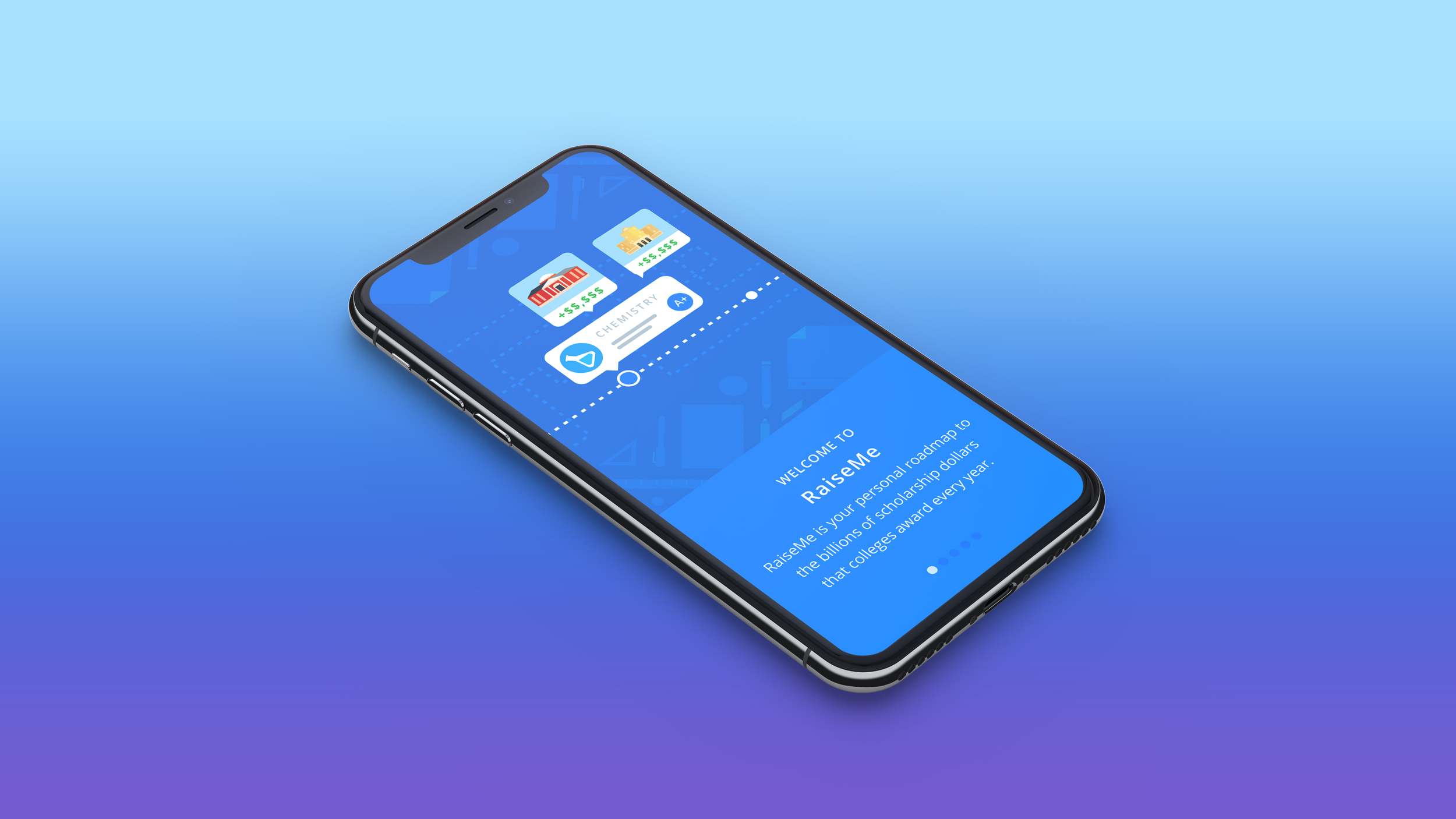
Overview
I helped launch the RaiseMe iOS App in 2017 which has since received 11K reviews and 4.8 of 5 stars in the Apple App Store.
Initially we aimed to bring the web experience to iOS, but discovered student confusion to be a high priority in addition to parity to web. We determined onboarding slides were necessary to alleviate confusion for launch and for learnings we could apply to our web experience.
About RaiseMe
RaiseMe works with colleges to break down their unique scholarship programs into bite-sized, actionable awards that students can accrue throughout high school within our product. For example, a college might award $150 in scholarships toward each A a student receives and records in their RaiseMe Portfolio. In doing so, RaiseMe creates transparency into what each college is looking for as well as the guaranteed minimum scholarship amount the college will award for a student’s achievements. This enables students to spend time and effort in areas that will lead to the next step in their academic journey and financially plan along the way.
My Role
I led the end to end design and animation of app onboarding slides through research, user testing, wireframing, visual design, and prototyping. I worked closely with the iOS engineering team to ensure design quality standards. I collaborated with the Product Manager and various other team leads across the company to identify user needs and visuals.
Problem
When we initially user-tested wireframes of essential iOS app flows with students over video calls, we found users thought that RaiseMe would be awarding them money—some users even asked when to expect a check from us in mail. We found the confusion made users drop off without entering anything, with an average of 0-1 entries in their first session. The Product Manager and CEO were worried that a confusing experience would greet our iOS app launch with 1-star reviews and angry users.
Project Goal
The goal for this project was to reduce confusion around how RaiseMe works for new users as soon as they installed and opened the app. It would be the first thing they see.
We would track success through the number of iOS support tickets received per month as well as user engagement (more achievements added via iOS than web). We intended to apply our learnings toward the RaiseMe web experience.
Discovery & Research
I reached out to the RaiseMe Support Team about this and learned they were receiving 100 support tickets per month regarding confusion about how the product works—specifically how and when earnings are received from the platform.
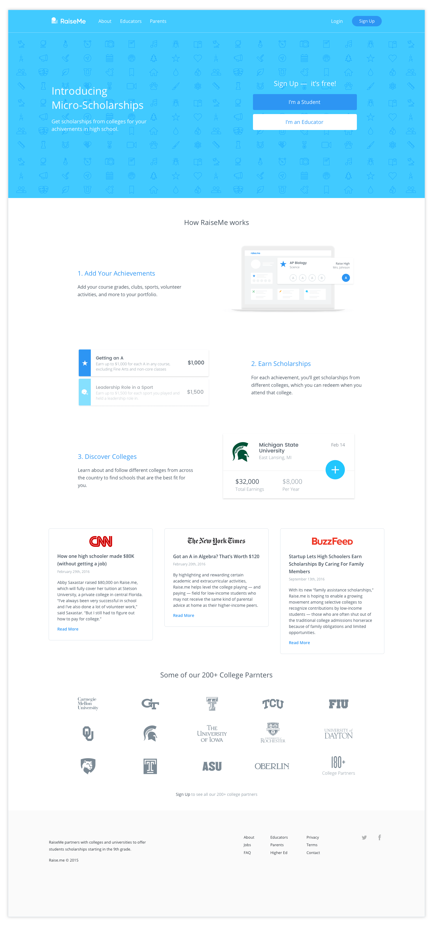
Another main source of confusion around how RaiseMe works was our homepage at the time, which provided an overly simplified illustration of how RaiseMe works
In additional user interviews with students, parents, and educators, I learned the confusion around RaiseMe added more stress to an already high-stakes college application process—in some cases, disrupting financial planning where students could not afford their intended college like they thought. I used the quantitative data from the Support Team and the qualitative data from our video calls to make the case to the PM and the CEO that we needed to solve student confusion before we launched the iOS app in less than 6 months. Working together, the PM and I decided on educating users as soon as they opened the app for the first time.
Exploration & Ideation
Collaborative Brainstorming
Another challenge we saw with our homepage was the use of static illustrations communicating complex concepts. We thought it would be more compelling to use animations on iOS in hopes that it would make RaiseMe easier to understand in an animated, mobile, and tactile way.
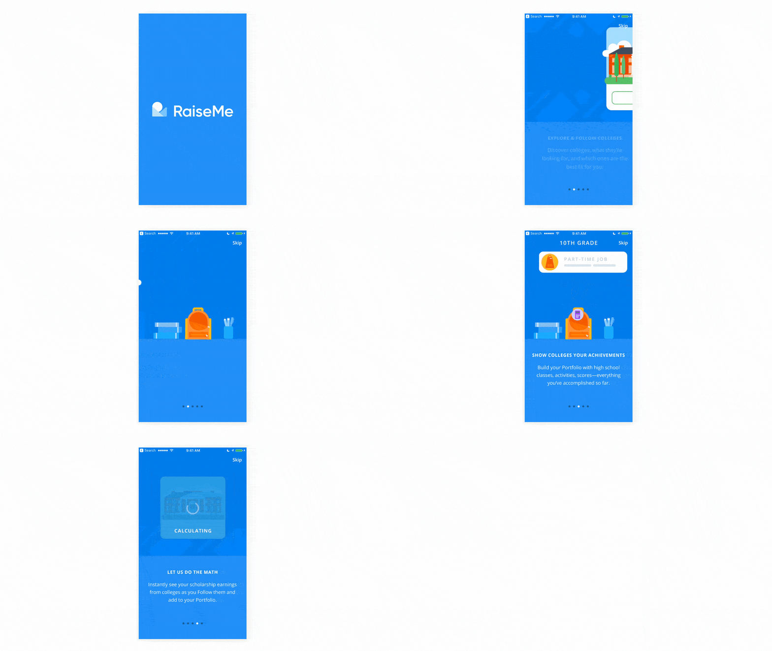
I looked at several prototyping tools such as Framer, Principle, and Facebook Keyframes. Through more research, I landed on Airbnb's Lottie in which you build animations in Adobe After Effects that then export to JSON. Visuals were to be done in Adobe Illustrator, brought into after effects, so using Lottie resulted in a seamless translation between design and code.
The PM and I agreed that upon opening the RaiseMe app (but before creating their account), the user should see educational slides that succinctly explain our product. The slides should ensure that students have a clear idea of what RaiseMe offers and how it works.
I worked closely with the product manager, support, and outreach teams to craft copy, distill key points, and brainstorm visualizations.
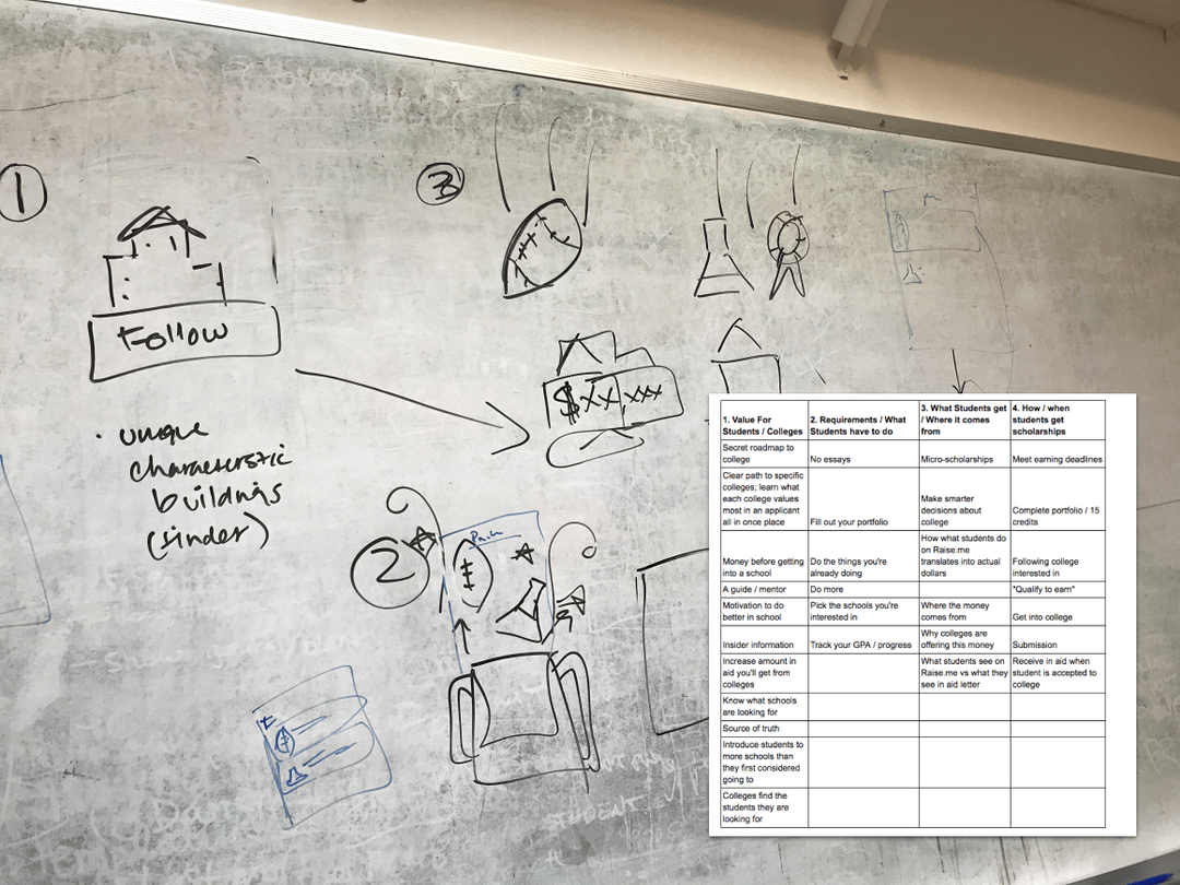
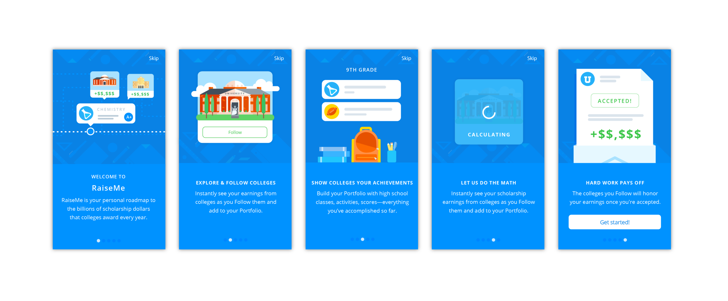
We initially broke the slides into 4 sections:
Value prop to students
Emphasize diversity of college partners and “Following a College” concept
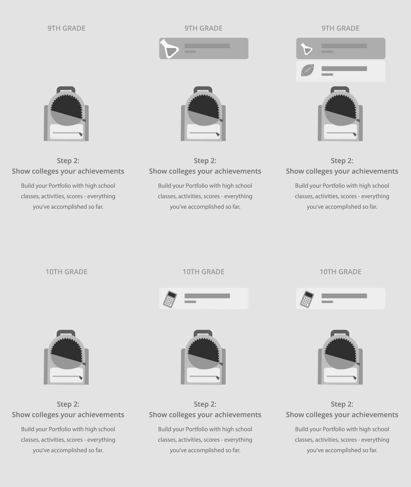
Emphasize adding achievements into RaiseMe throughout 9th-12th grade
Earn scholarships through Following colleges and entering achievements; demonstrate the scholarships come from the colleges and not RaiseMe
Proof of Concept
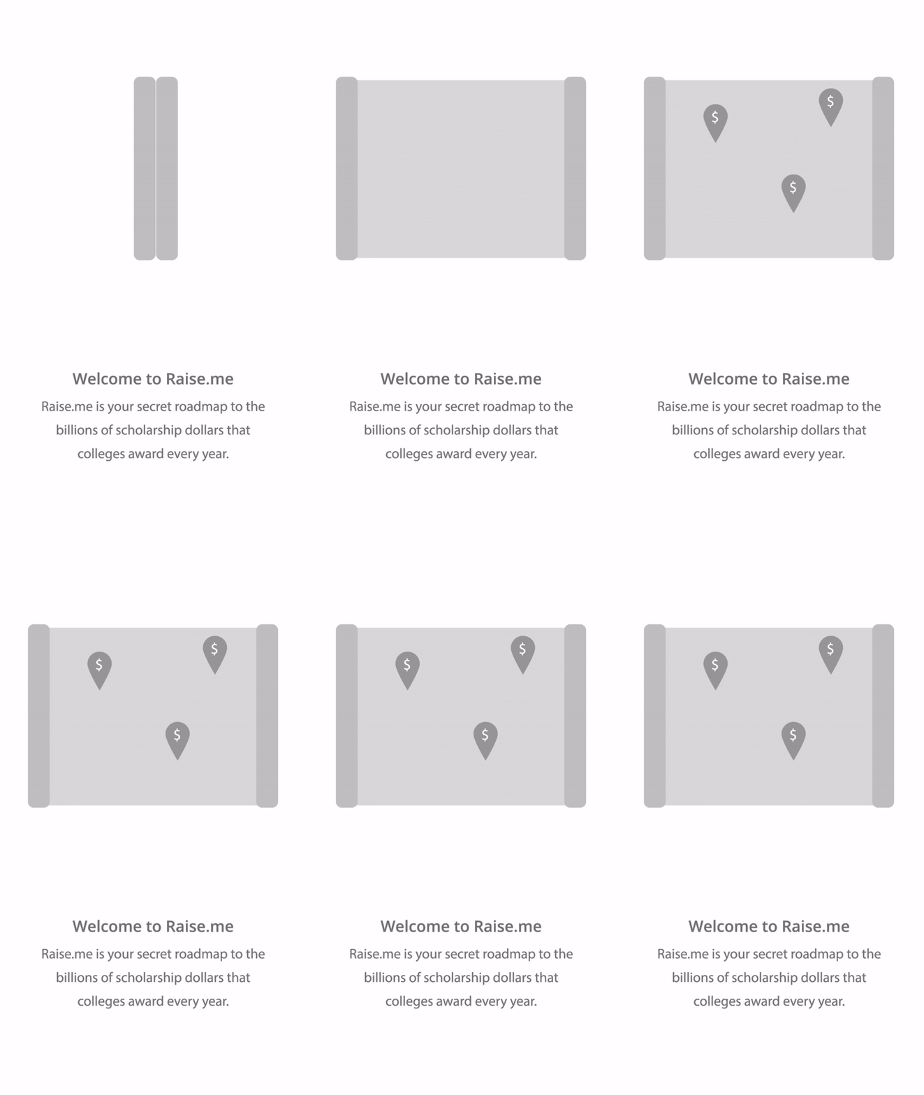
Based on the collaborative brainstorm, I created an initial animated wireframe for each slide; a title screen and 3 steps.


Feedback and Iteration
I collected feedback on visuals and copy from all stakeholders; leads of Sales, Partnerships, Growth, Marketing, Support, Engineering, Product teams and the CEO.
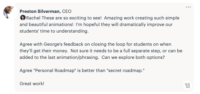
Based on the feedback, we agreed on having a fourth step to include the entire user journey—receiving a scholarship award letter containing their RaiseMe earnings. This ties back to our goal of providing more clarity around how students receive their earnings.
Development
I made sure to check-in with our remote iOS engineers along the way to make sure I was meeting tech feasibility criteria. They had never used Lottie before, but were excited to learn.
Because of our learning curve in working with Lottie, we had a very open line of communication. Otherwise, I was sent previews throughout the sprint for feedback and questions.
Launch
After kicking off designs in February 2017, RaiseMe's iOS app launched in August that same year. 🎉
Through cross-team collaboration, we developed education slides that every student would see after downloading RaiseMe from the Apple App Store.
Post-Launch Results
Signed up 400,000 new students in less than two months, reaching a total of 1 million students on RaiseMe
Collective decrease in monthly student confusion support tickets by 15% across all platforms
Increased achievements added from 0-1 to 1-3+ in a student's first session
Average micro-scholarships earnings per student increased from $15,000 to $25,000
Increased the average number of schools a student earned micro-scholarships from from 6 to 11
Featured in the Apple App Store
Reached the top 25 in the Education apps category in the Apple App Store
Featured on AirBnb’s Lottie Website in 2017-19
Next Steps
Because we found success in using animations and imagery to better explain how RaiseMe works, I worked with our Student Growth team lead and another Product Manager to push for a general Explainer Animation video.