Overview
I helped launch the RaiseMe iOS app in 2017 which has since received 19K reviews and 4.8 of 5 stars in the Apple iOS App Store. Initially we aimed to bring the web experience to iOS, but discovered student confusion to be a high priority in addition to parity. Part of this initiative meant rethinking how RaiseMe communicates important scholarship earning requirements for iOS.
About RaiseMe
RaiseMe works with colleges to break down their unique scholarship programs into bite-sized, actionable awards that students can accrue throughout high school within our product.
For example, a college might award $150 in scholarships toward each A a student receives and records in their RaiseMe Portfolio.

In doing so, RaiseMe creates transparency into what each college is looking for as well as the guaranteed minimum scholarship amount the college will award for a student’s achievements. This enables students to spend time and effort in areas that will lead to the next step in their academic journey and financially plan along the way.
My Role
Lead end-to-end design through research, wireframing, interaction design, visual design, prototyping and cross-team collaboration.
I worked closely with the Engineering teams to understand technical constraints and ensure design quality standards, the Product Manager to identify user needs and adjust project goals as the project evolved, and the Customer Success team to better identify areas of student confusion.
Background
As part of the larger effort to launch the RaiseMe iOS app, I was responsible for designing the Earnings Tracker experience so that students could track their scholarship earnings across the multiple colleges they were interested in.
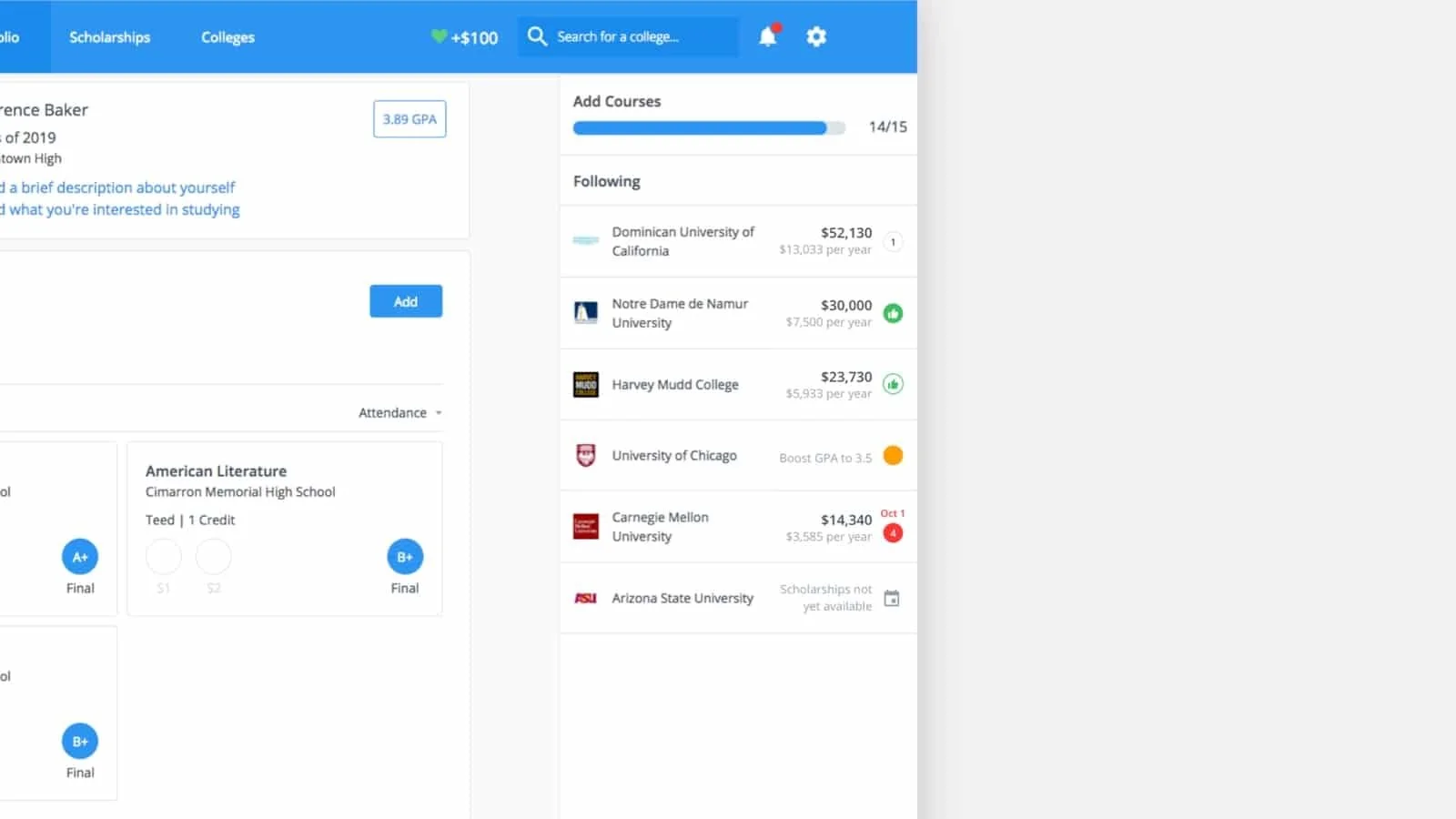
The Earnings Tracker is a core pillar of the product, as students use it to track the scholarships they are earning from each school and make sure they are meeting all eligibility requirements. Therefore, it was imperative that the Earnings Tracker was simplified, focused and easier to comprehend on both desktop and mobile, given its many states and notifications on desktop and the lack of screen real estate on iOS.
The Problem
Initially, the project was scoped the use the existing web design and translate it to our iOS product. After diving deeper into the various states of the Earnings Tracker on web, I found the existing design was overwhelming—providing both unnecessary and under-explained information. More specifically, the design pattern used to indicate the various requirements was unclear, risking students losing out on their entire scholarship earnings if not resolved in time.
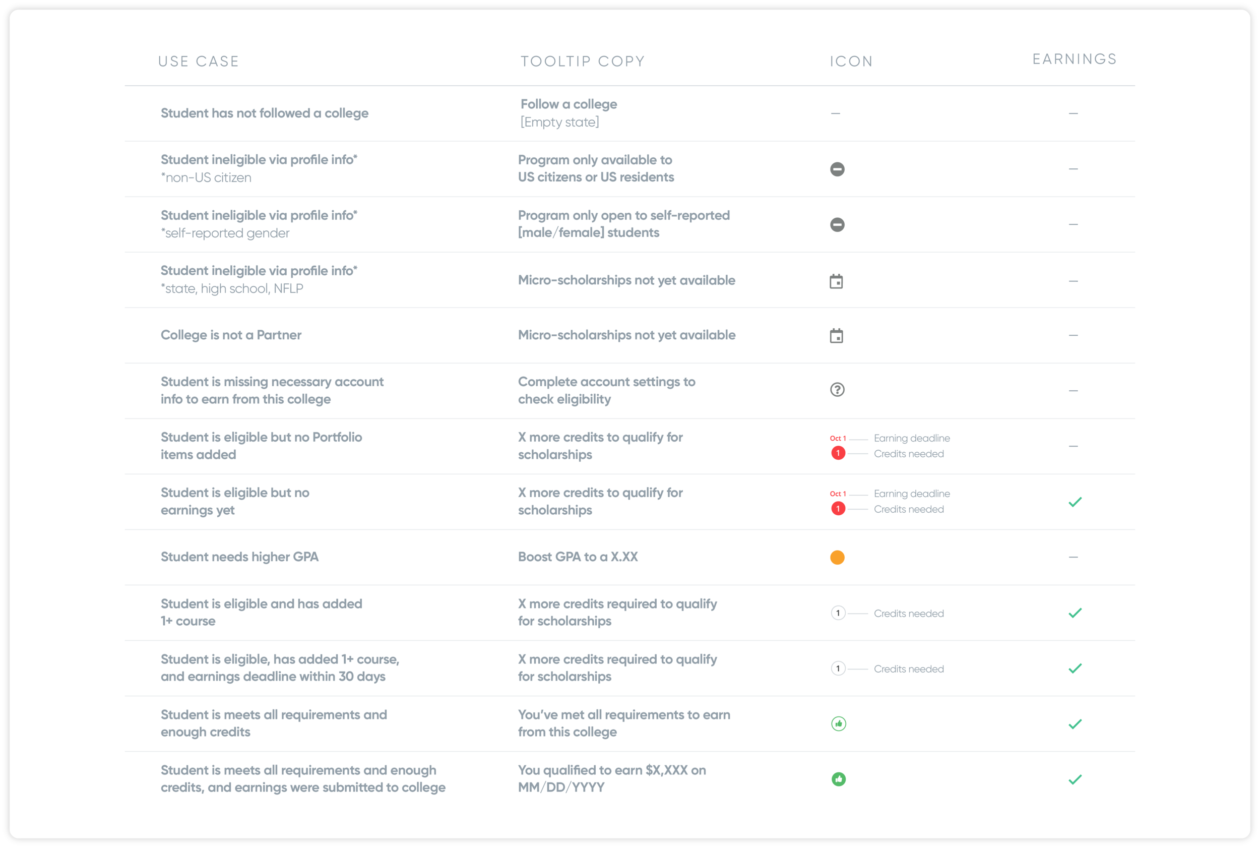
In order to assess what we currently communicate in the Earnings Tracker, I looked at the existing web design and created a spreadsheet breaking down different college earning states and what they mean.
Business Goal
Increase student reach by creating an iOS app experience
Design Goal
Reduce student confusion around earnings and eligibility to increase the number of students successfully earning micro-scholarships
Clearly communicate blockers and deadlines
Encourage achievement adding for first-time-users through delight
Measuring Success
Reduce support tickets around earnings deadlines
Reduce number of students with incomplete account information for iOS
Increase the average number of achievement items added to the student Portfolio

Research & Exploration

I first reached out to our Customer Success team to understand if support tickets correlated with confusion around earnings statuses. We found that a large number or our support tickets revolved around earnings deadlines and when earning eligibility was in the student’s control.
Working with the Product Manager, I organized a survey sent to 2,000 seniors to see how students currently interpreted each status on the tracker. The students were shown 4 trackers with varying statuses and were asked to explain what they observed about the each tracker’s earnings.
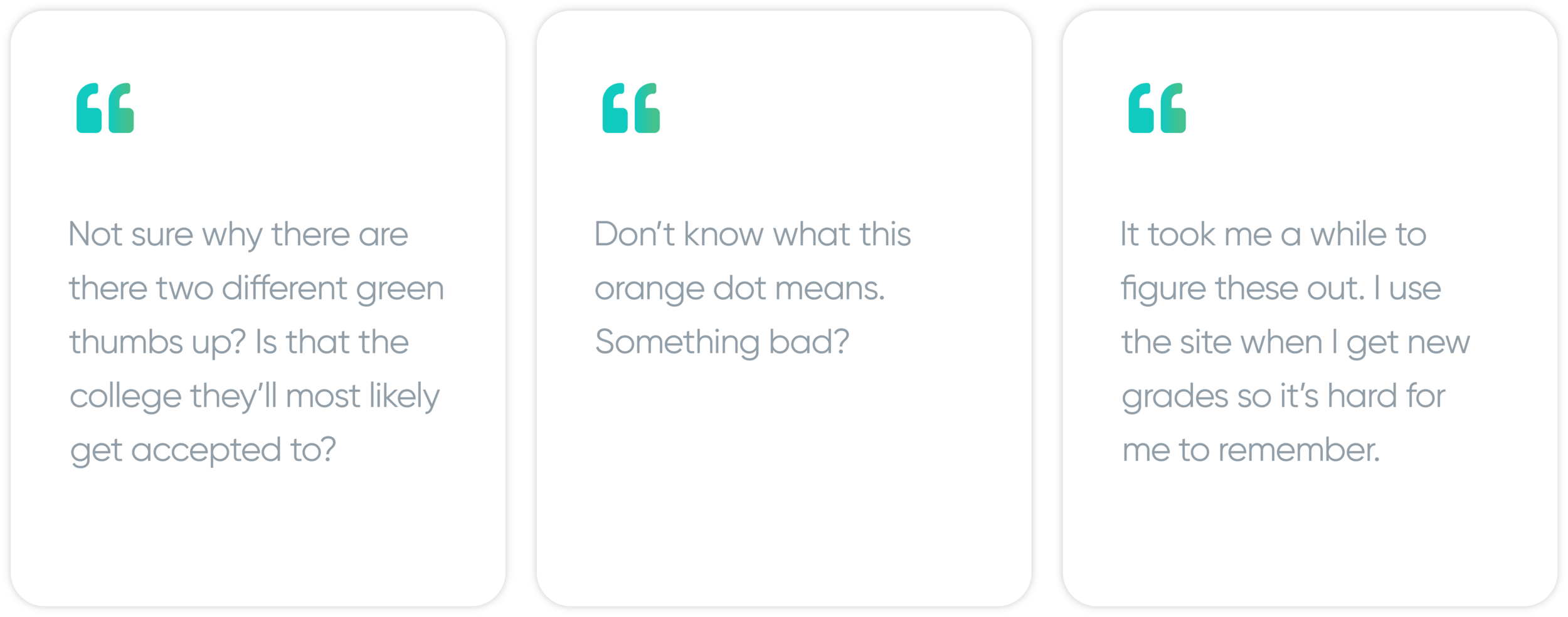
Quotes from the student user survey
I confirmed our tracker relied too heavily on tooltips to convey the meaning of each status and that certain statuses were too similar looking to tell apart.
Ideation
Defining Use Cases and Flows
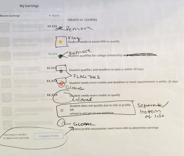
Auditing the existing types based on survey feedback and support team data
There were states for when students were blocked from earning scholarships and needed to take action. In order to reduce the over-communication, it made sense to flag only certain states—the blockers and actionable notifications.
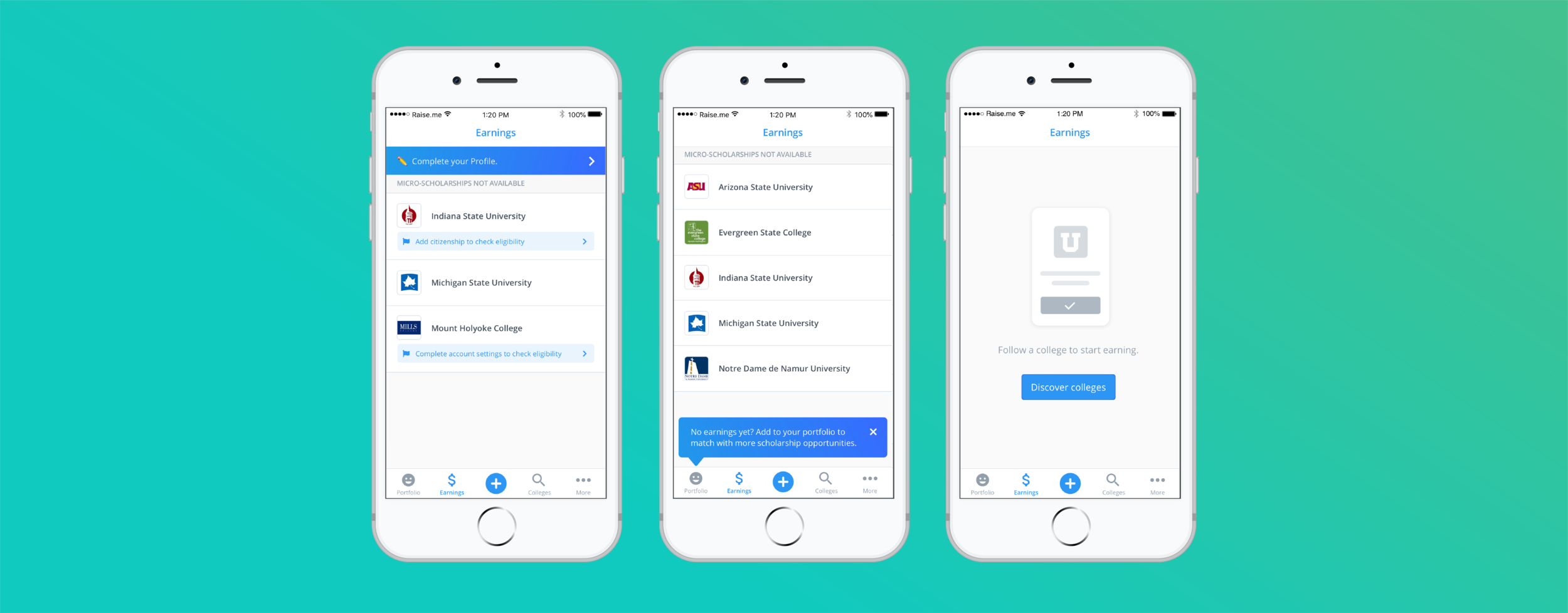
I also pulled out certain states that felt more like global messages as they have to do with other sections of the app like completing profile information.
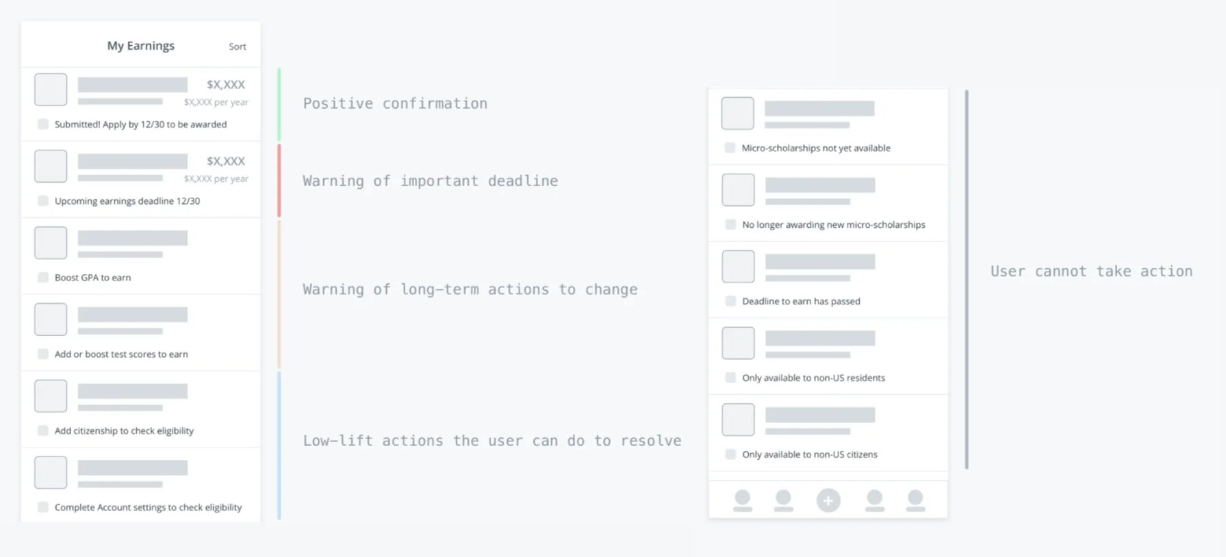
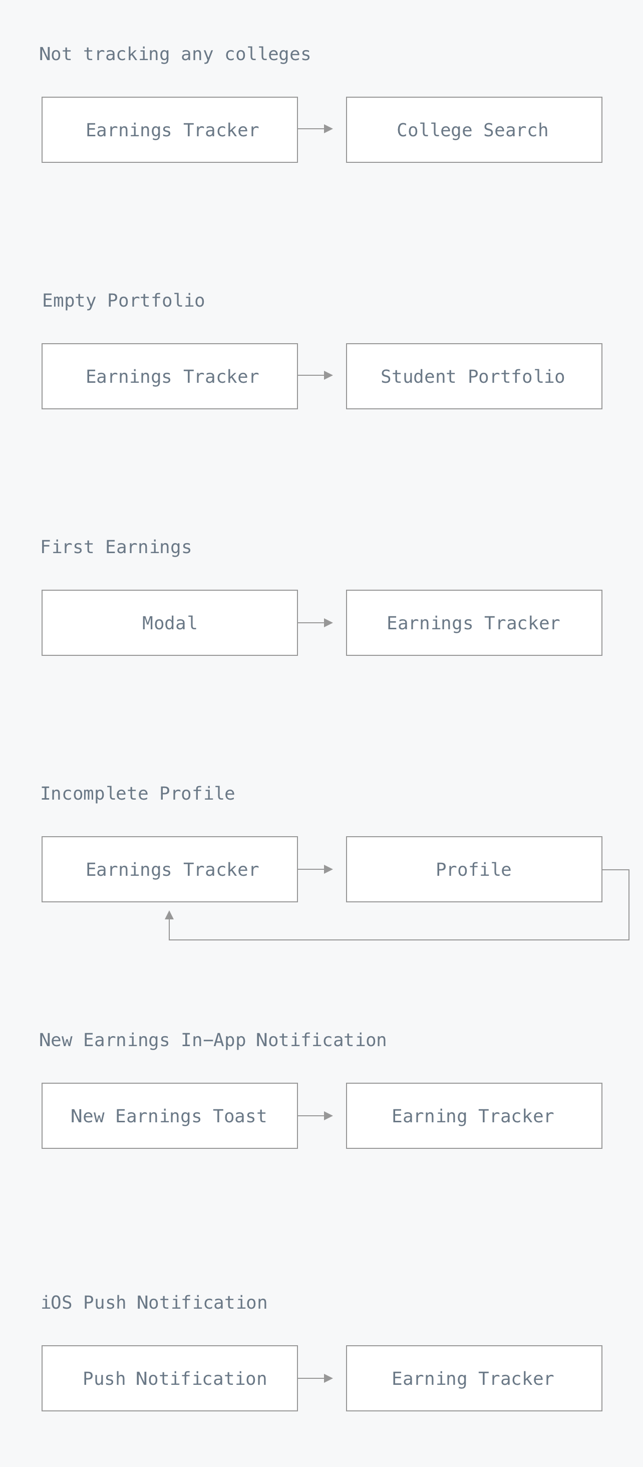
Noting high level flows based on the various statuses and use cases helped scope what needed designs.
Designs
Earnings Tracker List
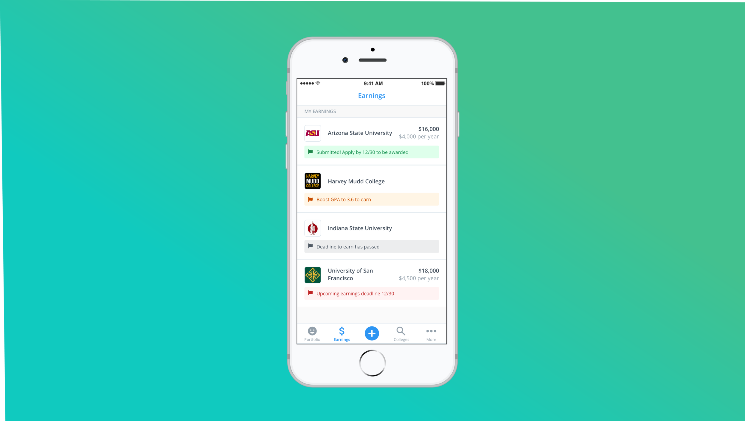
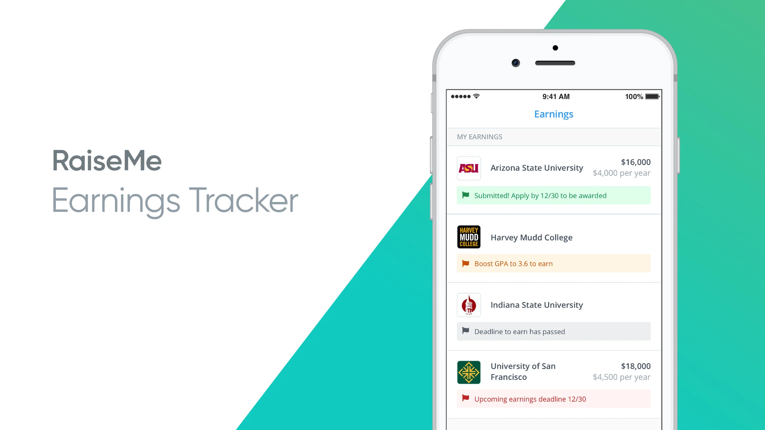
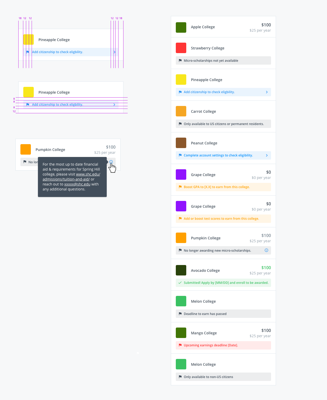
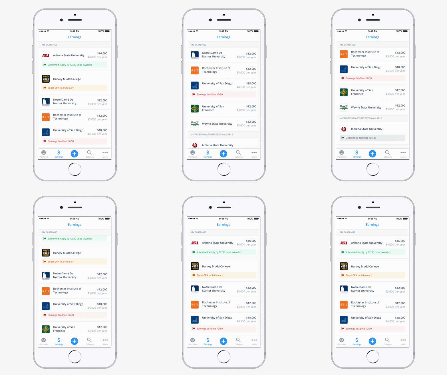
Aside from the variation of earning statuses, part of what made the existing design pattern confusing was its use of symbols and reliance on tooltips. It was too coded for such important and complex messaging. Working with the PM and Customer Success team on copy, I displayed the statuses as copy in the redesign so that students would have a clear understanding of why they weren’t earning from a specific college and what they could do about it.
I used color to indicate the severity of the requirement status as well as making them deep links that direct students to the solution or problem area when possible. The design solution allowed us to develop one pattern that worked across web and mobile platforms to create consistency for students switching between the two.
Low-Lift Actions to Check Eligibility
Users would be prompted to navigate to area of the app to provide more information about themselves or add achievements. To combat student confusion around eligibility, it was important to call out the actions and where to take them.
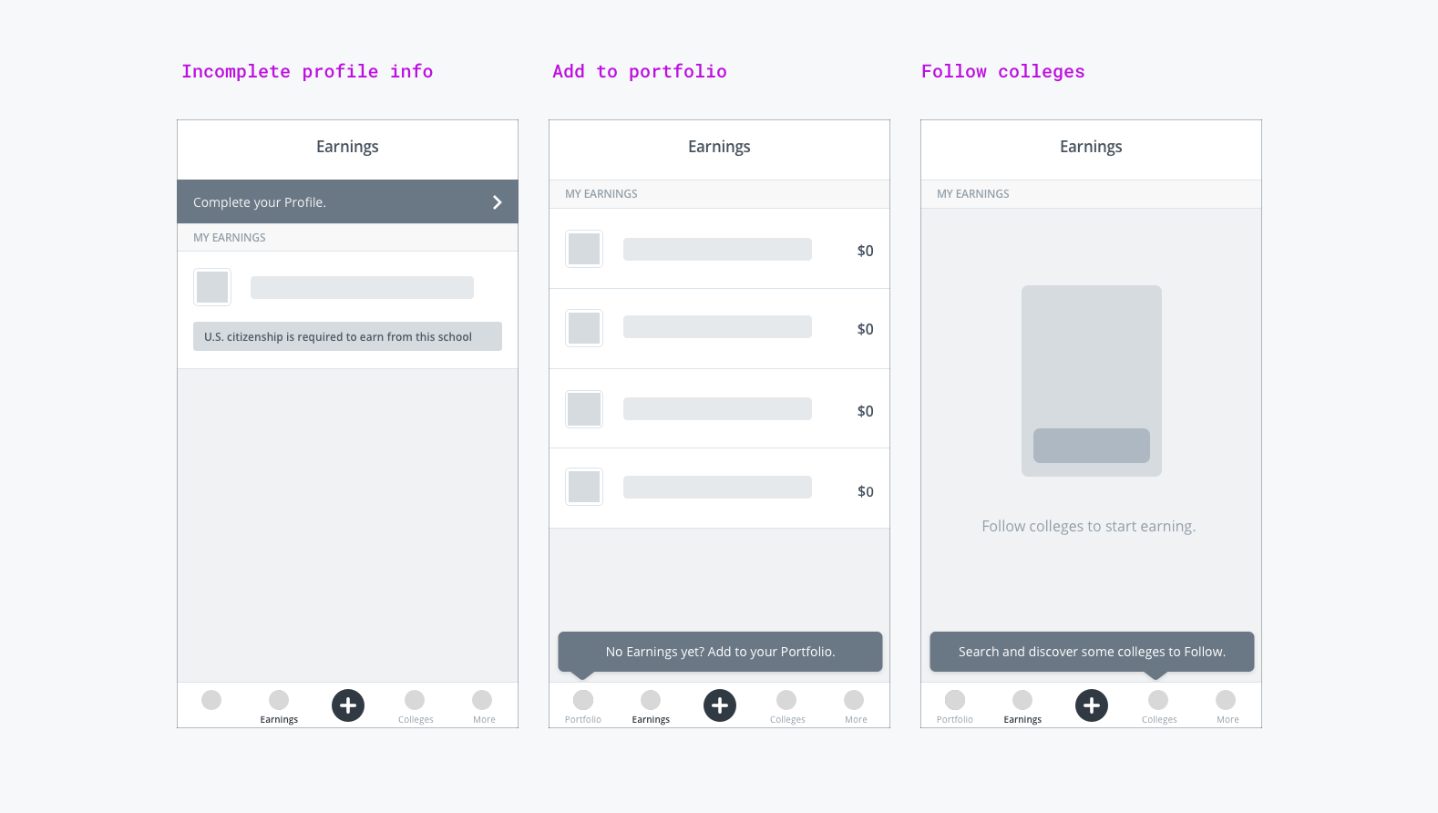
In doing so, I questioned whether or not we should add some of these items to registration so that we would need less in-product interruptions about them. I worked with the PM to prioritize a later A/B test on web so we could see whether it negatively impacted our registration completion rates. In the meantime, we kept the in-product messaging until we were able to run the registration test after the Fall (our biggest season).
Communication and celebration of total earning increases
Initially, I explored showing the user feedback that their earnings were calculating after having entered an achievement into their portfolio.
After working closely with engineering to understand earning calculation constraints, I found it made more sense to only show a success message when the earnings calculation had completed. This was because the student is not guaranteed earnings for what they entered and the backend code didn’t allow us to know this ahead of time, so it was best to avoid leading the user to always anticipate earnings if it is not guaranteed.
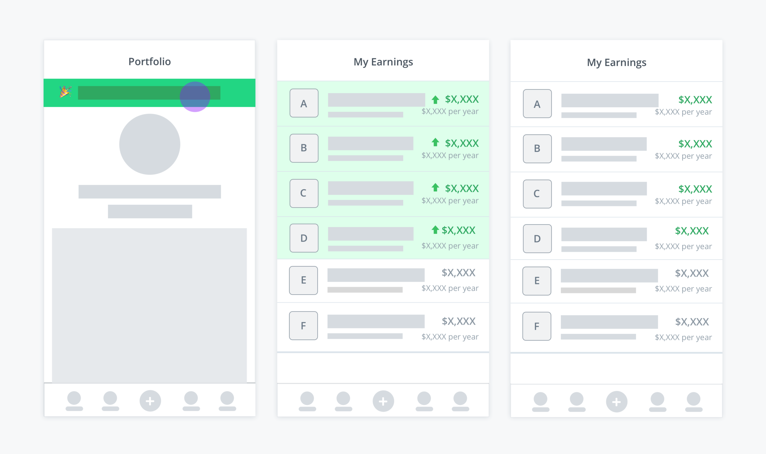
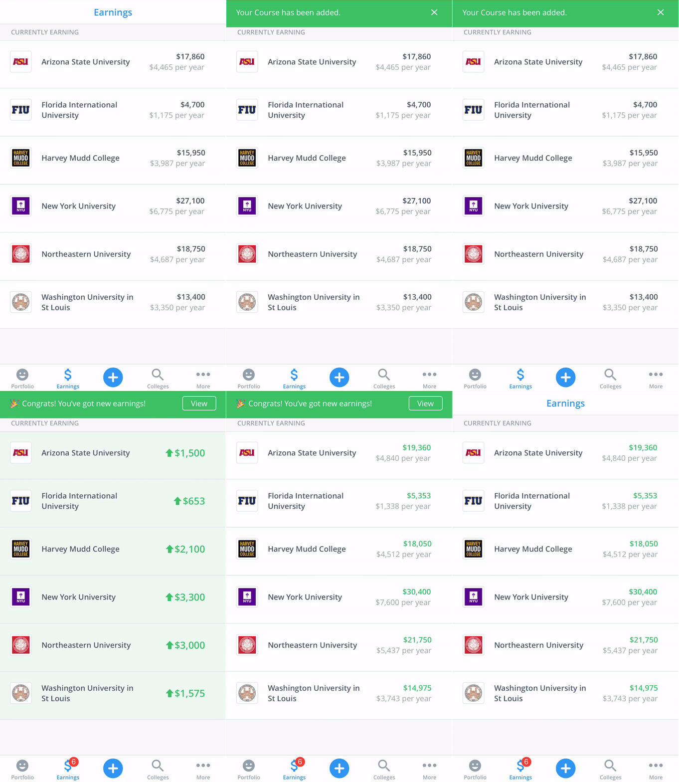
New earnings animation
When the user receives new scholarship earnings from entering achievements into their portfolio, they can view their total earnings increase, with the new totals highlighted in green. I worked with multiple members of the engineering team to understand the tech constraints of calculating a student’s earnings and why notifications need to be flexible as they may not always appear instantaneously. This is where we could leverage iOS push notifications.
Beta Testing with Real Users
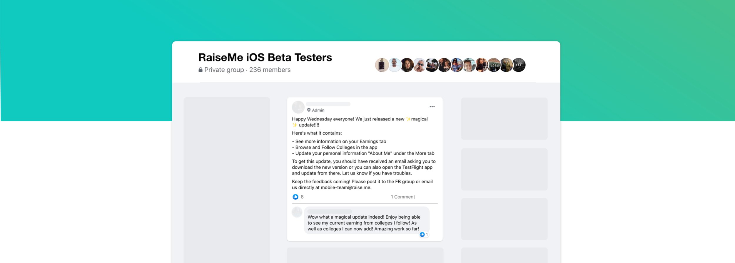
We used a Facebook group where we would allow students to beta-test our app as we released each part and added parity to web. We used this as a gut-check before the official app launch—luckily students were excited about the new earnings tracker view.
Delivery
For our MVP launch of the app, the earnings statuses would clearly provide information and allow us to collect data on what we could visually scale back on in a later releases.
The most important factor for users is that they are able to have the information they need to successfully earn scholarships, as each senior class has only one opportunity before applying to college.
Post-Launch Results
Additional Results
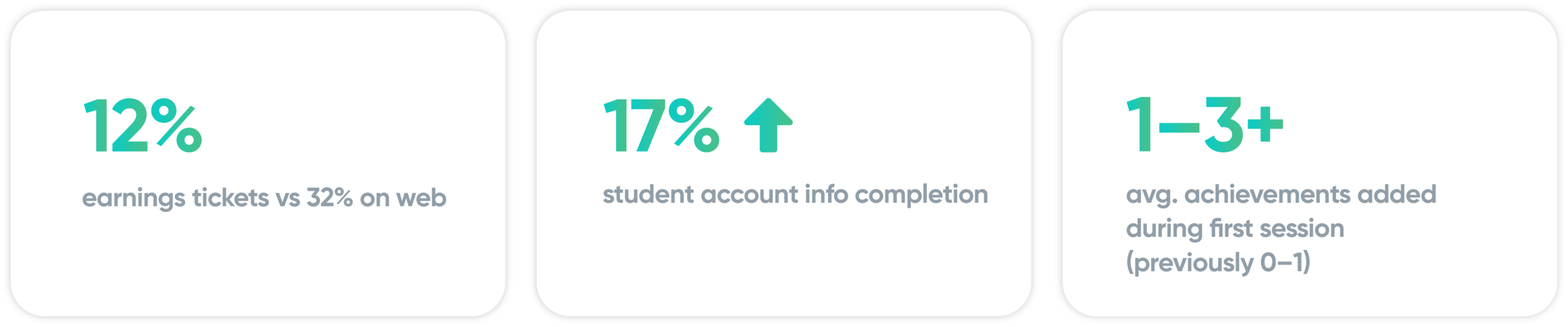
Signed up 400,000 new students in less than two months, reaching a total of 1 million students on RaiseMe
Student account profile completion increased from 64% to 81% across iOS and web
Collective decrease in monthly student confusion support tickets by 15% across all platforms
Average micro-scholarships earnings per student increased from $15,000 to $25,000
Increased the average number of schools a student earned micro-scholarships from from 6 to 11
Featured in the Apple App Store
Reached the top 25 in the Education apps category in the Apple App Store
Reflections and Iterations
One lesson that proves itself to be true in design is to question everything, especially MVPs. This was especially helpful for this project, as translating our web experience to our app like initially planned would have spread an existing problem to a new experience.
Understanding the technology behind our earnings evaluation engine was really helpful in making UX decisions, but also built a stronger working relationship with many members of the engineering team. This understanding of our evaluation engine proved to be helpful in designs later on and gave perspective on how much is working behind the scenes every time a student adds an achievement to the platform.

It was really inspiring to utilize feedback from the beta testers group we created on Facebook before the launch in addition to the user surveys.
Since this project, I’ve revised the design through the development of our styleguide which has improved our colors so they meet accessibility guidelines.